I used to paint everything. Every rock, every wave, every shadow. The result was technically good and emotionally nothing. It looked like a photograph with worse resolution.
Then I sat on a beach near my town for three hours and just watched the light change. I realized that what makes a Cretan coastline beautiful isn't the detail - it's the relationship between three or four colors and one clean horizon line.
That's when I started stripping things away.
What minimalist doesn't mean
It doesn't mean empty. It doesn't mean boring. It doesn't mean a white canvas with a single dot.
Minimalist landscape art means finding the essential shapes and colors that make a place feel like itself, and removing everything else.
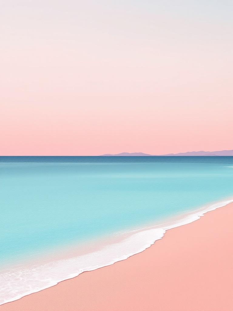
Elafonisi isn't about the rocks or the seaweed or the tourists. It's about pink meeting turquoise meeting cream. Three colors, one diagonal shoreline. That's the print.
Why it works in Mediterranean homes
Mediterranean spaces already have a lot going on. Stone walls, wooden beams, terracotta floors, the view. Busy art competes with all of that. Minimalist art complements it.
A clean landscape print on a white wall doesn't fight for attention. It echoes what's outside the window in a quieter voice. It says: I noticed the same thing you notice every day, and I thought it was worth holding onto.
The palette of Crete
Every print I make uses colors that actually exist here. Not saturated Instagram colors - real ones.
The turquoise at Makrigialos isn't the same turquoise at Elounda. The sandstone at Heraklion isn't the same sandstone at Sitia. I spend time matching colors to specific places because that specificity is what makes a print feel authentic.
Cream skies, terracotta hills, deep navy water, sage green mountains, soft pink sand. These are the colors of Crete and they're the only palette I work with.
Choosing the right print for your space
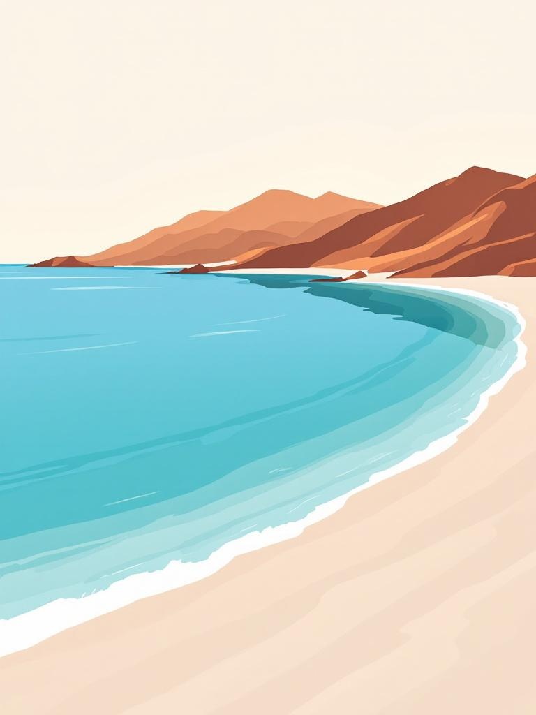
Bright rooms with lots of natural light: Go for softer colors. Elafonisi, the watercolors, Vai Palms. Strong light will make bold colors look aggressive.
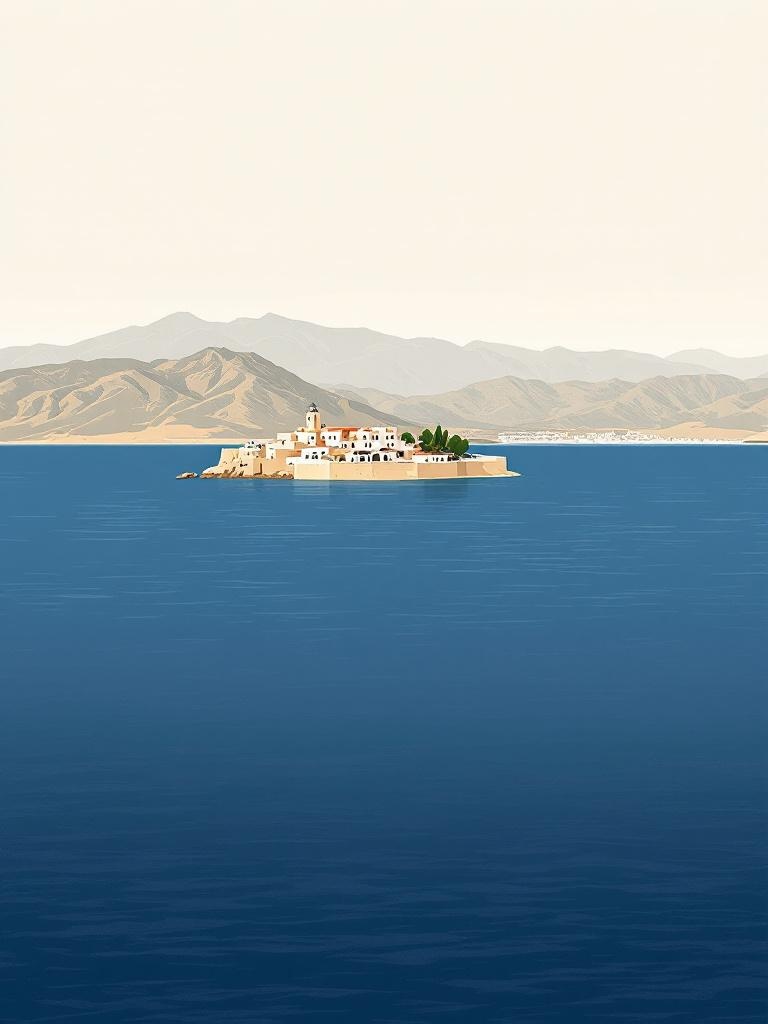
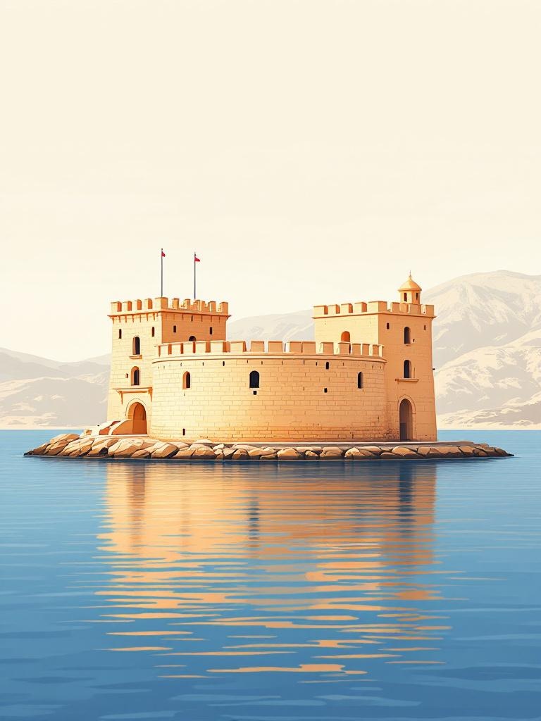
Darker rooms or north-facing walls: You can handle more contrast. Elounda/Spinalonga with its deep navy, or the Heraklion Fortress.
Above a sofa or bed: Landscape orientation or a horizontal set of 3. Creates visual width.
Narrow hallways: Single portrait-format prints spaced evenly. The gorge prints (Samaria, Pefki) work perfectly in narrow spaces.
The whole collection is at thecretaneleni.com/collections/minimalist.